By Nick Phillips
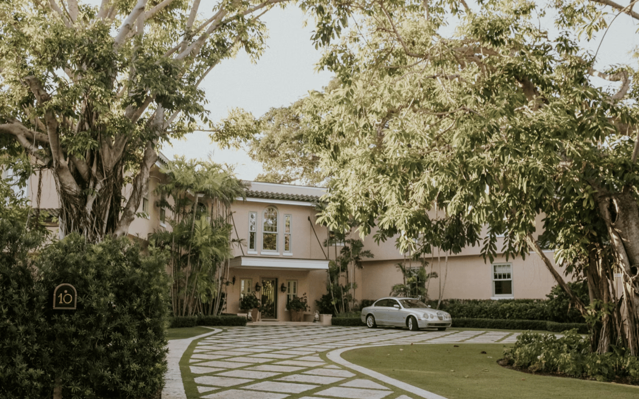
When clients walk into a home along 30A, the first thing they notice is often the color palette. The right paint tones can make a space feel larger, brighter, and more connected to the coastal lifestyle buyers expect here. I often talk with homeowners about how to choose colors for a room because thoughtful color decisions can influence both daily living and long-term property value. When you understand the science behind color and light, choosing paint becomes much easier.
Key Takeaways
- The way light interacts with color plays a major role in choosing colors for a room.
- Neutral coastal palettes often appeal to luxury buyers in the 30A market.
- Each room should use color strategically to support its function and mood.
- A consistent palette throughout the home helps protect resale value.
Understanding Natural Light in 30A Homes
Natural light is one of the most important factors when deciding how to choose colors for a room, especially in homes along 30A. Large windows, open layouts, and proximity to the Gulf create unique lighting conditions that affect how paint appears throughout the day.
How Light Changes Color Throughout the Day
- Morning light tends to make colors appear cooler and softer.
- Midday sun can brighten tones and highlight undertones.
- Evening light often warms paint colors and deepens contrast.
- Reflections from water and sand can subtly influence interior colors.
- North-facing rooms usually need warmer tones to balance cooler light.
When I walk through a property with sellers, I always make sure we test paint samples in different lighting conditions. What looks perfect at noon may feel completely different at sunset, especially in waterfront homes along 30A.
Choosing a Base Palette for Coastal Luxury Homes
When thinking about how to choose colors for a room in a luxury coastal property, starting with a consistent base palette is one of the top strategies. This approach keeps the home feeling cohesive and refined.
Elements of a Strong Whole-Home Color Palette
- Soft whites that reflect natural light
- Warm neutral tones like sand or light taupe
- Muted coastal blues or greens as accents
- Subtle gray tones that complement stone or wood finishes
- Natural textures like limewash or matte finishes
Luxury buyers touring homes along 30A often respond well to palettes that feel calm and sophisticated. I like to use tones that echo the coastal environment while still maintaining a polished interior design style.
How to Choose Colors for a Room Based on Function
Every space in a home serves a different purpose, which means color choices should support how the room is used. Understanding this is a key step in learning how to choose colors for a room effectively.
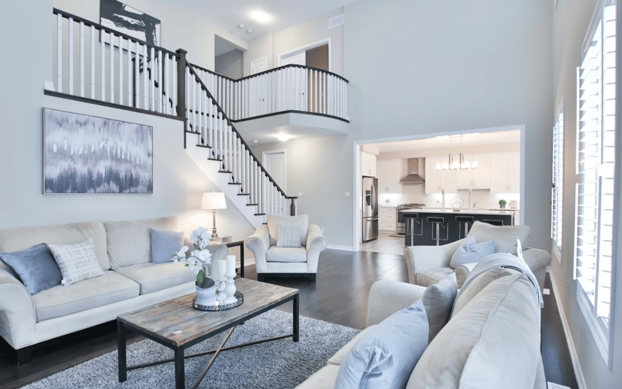
Living Room Color Strategy
- Use warm neutrals to create an inviting gathering space
- Consider soft blues or greens that reflect the coastal setting
- Make sure the main wall color complements the flooring and furniture
- Use slightly lighter tones to enhance open floor plans
- Accent walls can add interest without overwhelming the room
In many 30A homes, living rooms connect directly to outdoor spaces. I recommend colors that transition smoothly from indoor living areas to patios, balconies, or Gulf-facing terraces.
Creating Relaxing Bedroom Color Schemes
Bedrooms should promote rest and comfort, which makes color selection especially important. When deciding how to choose colors for a room designed for relaxation, subtle tones usually work best.
Bedroom Color Guidelines
- Soft blues and pale greens help create a calming atmosphere
- Light neutrals make smaller rooms feel larger
- Warmer whites work well with natural wood finishes
- Avoid overly dark colors that can make the room feel closed in
- Layer tones with bedding and textiles rather than bold wall colors
In many luxury homes I represent along 30A, buyers look for bedrooms that feel like private retreats. Paint colors that feel light and tranquil often make the strongest impression during showings.
Kitchen and Dining Area Color Decisions
Kitchens and dining spaces benefit from colors that feel clean, timeless, and bright. These areas often serve as central gathering points in a home, especially in open coastal layouts.
Popular Kitchen Paint Approaches
- Crisp white walls paired with natural wood accents
- Warm neutral tones that complement cabinetry
- Light gray shades for a modern coastal feel
- Soft blue accents that reflect nearby water views
- Neutral backdrops that allow countertops and fixtures to stand out
When sellers ask me how to choose colors for a room like the kitchen, I remind them that simplicity often performs best in the real estate market. Buyers want a space where they can easily imagine their own style.
Using Accent Colors Without Overwhelming the Space
Accent colors are a powerful design tool when used correctly. They can add personality to a home while keeping the overall palette balanced.
Smart Ways to Use Accent Colors
- Paint a single architectural feature, like built-ins or trim
- Use accent tones in smaller rooms like powder baths
- Coordinate accent colors with artwork or furniture
- Make sure accent tones relate to the primary palette
- Avoid using too many bold colors throughout the home
Along 30A, subtle coastal accents often resonate with buyers. A carefully chosen color can highlight design details while still keeping the home feeling refined and market-ready.
FAQs
How do I start when learning how to choose colors for a room?
Start by identifying the natural lighting conditions in the space and selecting a neutral base color. From there, you can layer complementary tones through accent walls, furniture, and décor. Testing paint samples at different times of day helps make sure the color works in all lighting conditions.
What paint colors help increase home resale value?
Neutral tones usually perform best in the real estate market. Soft whites, warm grays, and subtle coastal hues appeal to a wide range of buyers. In the 30A market, palettes that reflect the coastal environment often make homes feel more connected to the lifestyle buyers expect.
Should every room in a home be a different color?
A consistent palette throughout the home typically works better than dramatically different colors in every room. Subtle variations of the same tones create flow and cohesion. This approach also helps buyers focus on the home itself rather than being distracted by bold paint choices.
Contact Nick Phillips Today
If you are preparing to sell or simply want expert insight into maximizing your property’s appeal, I am always happy to help. Paint colors, design updates, and presentation strategies can all influence how buyers perceive your home, especially in a competitive luxury market like 30A.
As a broker associate with Scenic Sotheby’s International Realty, I specialize in premier waterfront and lifestyle properties along Florida’s Emerald Coast. In 2024 alone, I closed more than $84 million in sales, including a landmark $13.9 million residential transaction. My experience in the 30A market allows me to guide sellers and buyers with a strategic approach that focuses on results and long-term value.
For more insights into the 30A luxury real estate market or to discuss your property goals, be sure to connect with me today.